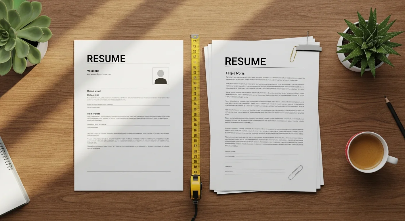
Lena Brandt at Outline Technologies leans back, the blue light of her monitor painting a faint glow on her face. It’s 9 PM. Two resumes for the same Senior Designer role are open side-by-side. On the left, a crisp one-pager from "Anya." It’s tight. A four-line summary, a skills section that’s all hard skills, and three distinct roles from the last eight years. Each bullet point starts with a verb like ’shipped,’ ’redesigned,’ or ’led.’ It’s all signal, no noise. Lena scans it, nods, and drags it to the ’Interview’ folder. It took her ten seconds. On the right is a resume from "Mark." It’s three pages long. The first page is half-filled with a personal mission statement and a list of soft skills like ’synergistic communicator.’ His experience section starts in 1998 with an internship designing CD-ROMs. Lena’s eye twitches. She scrolls, seeing dense paragraphs where bullet points should be. She doesn’t have time for this. She’s not on an archaeological dig. She’s filling a role. She closes the file without reaching the end of page one. Mark’s 25 years of experience, lost to the void.
Your resume isn’t your autobiography. It’s a marketing document with one goal: to get you an interview. The single most common mistake that gets you rejected before a human even reads your name is its length. The debate over how long should a resume be is endless, but the data isn’t. According to a study by TheLadders, recruiters spend an average of just 7.4 seconds on their initial screen of a resume. You don’t have time for a slow-burn narrative. You need a document that respects the reader’s time and delivers critical information with surgical precision.
The 7-Second Guillotine
That 7.4-second window is your entire world. In that time, a recruiter like Priya Anand at Northvale Search isn’t reading. She’s pattern matching. Her eyes dart across the page in a predictable ’F’ or ’Z’ pattern, looking for keywords, titles, company names, and dates that align with the job description. A dense, multi-page document breaks this pattern. It forces the recruiter to hunt for information, a task they simply don’t have the time or patience for. A resume that’s too long suggests you can’t prioritize information, a fatal flaw for almost any professional role.
Think of it this way: the recruiter has a mental checklist. "Does this person have 5+ years of UX experience? Check. Have they worked in a SaaS environment? Check. Do they know Figma? Check." A well-structured, concise resume allows them to tick these boxes almost instantly. A long resume buries these answers under paragraphs of prose, irrelevant early-career jobs, and generic skills. By the time they’d find the answer on page two, they’ve already moved on to the next candidate who made it easy for them. The first impression isn’t just your experience; it’s the presentation of that experience. Clutter signals a cluttered mind. Brevity signals confidence and clarity.
The Unforgiving ATS Gauntlet
Before your resume even reaches human eyes, it almost certainly has to pass through a machine: the Applicant Tracking System (ATS). Over 98% of Fortune 500 companies use an ATS to filter the flood of applications they receive. These systems are not sophisticated readers. They are parsing software, designed to extract and categorize information like your contact details, work history, and skills. And they are notoriously easy to confuse.
Excessive length is a primary culprit for ATS errors. A two-page resume might have a page break that cuts a work experience entry in half, causing the parser to miss the entire job. Complex formatting used to cram information onto a page, like tables or multiple columns, can be misinterpreted, jumbling your skills and experience into an unreadable mess. Jobscan’s data consistently shows that resumes with clean, single-column layouts and standard fonts parse with the highest accuracy. The longer your resume, the more opportunities you create for a parsing error to knock you out of the running. The ideal resume for an ATS is brutally simple and logically structured, which naturally lends itself to a shorter format. It’s a machine, after all. It doesn’t care about your process; it just wants the data.
The Experience Matrix: A Clear Guide to Resume Length
The question of "how long should a resume be" doesn’t have a single answer. It depends entirely on where you are in your career. Your resume should grow with your experience, but not in the way you might think. It’s not about adding pages; it’s about curating more impressive content into the same, or slightly larger, space.
0-3 Years of Experience: One Page. Period.
If you’re a recent graduate, in an entry-level role, or making a career change with limited direct experience, your resume must be one page. There are no exceptions. Attempting to stretch your experience to two pages is a massive red flag to recruiters. It signals you’re padding your resume with fluff, like detailed high school achievements, irrelevant part-time jobs, or verbose course descriptions. Instead, focus on maximizing that single page. Use a clean format from our one-page resume template collection to showcase internships, academic projects, volunteer work, and key skills. Quantify everything you can. "Managed the club’s social media" becomes "Grew the club’s Instagram following by 300% in one semester by creating a content calendar and running weekly Q&A sessions."
3-10 Years of Experience: The One-Page Ideal
This is where things get tricky. You have substantial experience, multiple roles, and real achievements. The temptation to spill onto a second page is strong. For most industries, especially tech, a single page is still the gold standard. A hiring manager for a Senior Software Engineer role wants to see your impact, not a laundry list of every technology you’ve ever touched. A powerful one-page resume for someone with 8 years of experience is a sign of an expert curator who knows what matters.
However, if every single line on your resume is a high-impact, quantified achievement directly relevant to the roles you’re targeting, a two-page resume can be acceptable. The key is relevance. If your second page contains a less-relevant job from seven years ago and a list of conference panels, cut it and stick to one. If it contains the project that saved your last company a million dollars, then two pages might be warranted. When in doubt, default to one.
10-20 Years of Experience: The Two-Page Standard
Once you’re a director, senior manager, or principal with over a decade of progressive experience, two pages become the norm. You simply have too much relevant leadership experience, strategic accomplishments, and high-impact project work to fit onto a single page without making it unreadable. The key here is to treat the first page like prime real estate. It should contain your summary, key skills, and your last 7-10 years of the most impressive, relevant experience. The hiring manager should be able to get everything they need to make a "yes" decision from page one alone.
Page two is for the supporting evidence: earlier (but still relevant) roles, publications, major projects, or certifications. Don’t let the quality drop. Every bullet point still needs to be an achievement, not a job description. A weak second page is worse than no second page at all. It dilutes the impact of the first.
20+ Years of Experience: Still Two Pages
You’re a VP, a C-suite executive, or a seasoned veteran with decades of experience. Your resume should be three, four, maybe five pages, right? Wrong. The rule still holds: two pages is the maximum for a corporate resume. No one is going to read about your accomplishments as a Junior Analyst in 1995. Your resume at this level is not a comprehensive history; it’s an executive summary. It should focus exclusively on the last 10-15 years of your highest-level, most strategic achievements.
Your early career can be condensed into a single section titled "Previous Professional Experience" with a simple list of titles, companies, and dates, with no bullet points. The focus should be on your executive leadership, P&L responsibility, market growth you’ve driven, and teams you’ve built. Anything else is noise that detracts from the powerful signal of your recent work.
Industry Exceptions to the Rule
While the one-to-two-page rule holds for about 90% of jobs, some specific fields operate under a different set of expectations. Knowing the norms for your industry is critical. Applying with a one-page resume for an academic post is just as bad as sending a ten-page CV for a startup job.
First, there’s academia and science. Here, you don’t use a resume; you use a Curriculum Vitae (CV). If you’re unsure which document you actually need for your situation, our breakdown of CV vs resume by country and industry clears that up in two minutes. A CV has no page limit. It is a comprehensive record of your academic life, including every publication, presentation, grant, fellowship, and course you’ve taught. A ten-page CV for a tenured professor is not uncommon. You can see some examples in our collection of CV examples. Second, federal government jobs often require much longer resumes. Applications on sites like USAJOBS often require you to detail how your experience matches the specific KSA (Knowledge, Skills, and Abilities) criteria listed in the job posting, leading to resumes that can easily reach four or five pages.
On the other end of the spectrum is the tech industry. There is a strong cultural preference for brevity and density of information. It’s common for even very senior engineers and product managers with 15 years of experience to have a sharp, one-page resume. The focus is purely on technical skills and quantifiable impact on products. Finally, fields like medicine and law can lean longer. Doctors may need space for publications, residencies, and board certifications, often pushing them to two or three pages. Lawyers might need to list significant cases, publications, or speaking engagements, which can also justify a longer format.
What Recruiters Cut First
When a recruiter is faced with a resume that’s too long, they don’t read faster. They skim, and in doing so, they mentally delete entire sections they deem irrelevant. Knowing what’s on the chopping block can help you edit your own resume with a more critical eye.
The first thing to go is ancient history. Unless a job from more than 15 years ago was at a universally impressive company (e.g., you were an early engineer at Google) or is foundational to a unique career path, it’s irrelevant. No one hiring a Director of Marketing in 2026 cares about your marketing internship from 2004. Condense it or cut it entirely. Next are the generic, unproven skills. Sections listing "Microsoft Office," "Public Speaking," or "Teamwork" are a waste of space. These are assumed competencies. Instead, prove them in your bullet points: "Presented Q3 marketing results to a 50-person executive team" demonstrates public speaking far better than the words themselves.
Objective statements are another relic. They are often self-evident (your objective is to get the job you applied for) and filled with empty buzzwords. Replace it with a 3-4 line professional summary that highlights your top qualifications and achievements. Finally, recruiters glaze over job duties disguised as accomplishments. If your bullet point reads "Responsible for managing the team’s weekly tasks," it’s getting ignored. It tells them nothing. It should read "Implemented an Agile workflow using Jira, cutting average task completion time by 20% over six months." One is a responsibility; the other is a result. Recruiters only care about results.
The One-Page Squeeze: A Masterclass in Compression
Getting a packed career onto a single page feels impossible, but it’s a game of inches. With smart formatting and ruthless editing, you can create a dense, readable, and powerful one-page document. It’s less about cutting content and more about optimizing space.
Start with the page layout. Set your margins to a minimum of 0.5 inches on all sides. Any smaller and it looks cramped. Next, your font. Choose a clean, sans-serif font like Arial, Helvetica, or Calibri. Set your body text to 10 or 10.5 points and your section headers to 12-14 points. Your name can be larger, around 18-22 points. Then, use a modern two-column layout. Our free CV builder has several templates that do this well. Put your main content (work experience, education) in the wider left column and secondary information (skills, contact info, certifications) in a narrower right column. This uses the horizontal space much more efficiently.
Next, edit the content itself. Kill the line "References available upon request." It’s a given. Remove your full mailing address; city and state are sufficient. For older, less relevant jobs, stack them. Instead of giving a full three-bullet-point entry to a job from a decade ago, condense it to a single line: "Associate Brand Manager, Acme Corp (2014-2016); Marketing Coordinator, Globex Inc (2012-2014)." This shows a career progression without wasting precious vertical space. Every line on your resume is valuable real estate. Don’t waste it on information that doesn’t sell you for this specific job.
Resume Length and Builder Features Comparison
Choosing the right tool can dramatically affect your ability to control your resume’s length and final presentation. Here’s how different options stack up.
| Feature | Microsoft Word | Google Docs | Zety | FreeCV.org |
|---|---|---|---|---|
| Template Control | High, but manual. Easy to break formatting. | Moderate. Templates are basic and hard to customize. | Low. Locked into proprietary templates. | High. Professionally designed and easy to switch. |
| Ease of Condensing | Difficult. Requires manual adjustment of all elements. | Difficult. Spacing and alignment are clumsy. | Moderate. Builder helps, but options are limited. | Excellent. Smart formatters adjust content automatically. |
| ATS Compatibility | Risky. Complex formatting often fails parsing. | Better, but still risky with tables or columns. | Good. Templates are generally ATS-friendly. | Excellent. All templates are tested for ATS parsing. |
| Page Management | Poor. Page breaks are awkward and manual. | Poor. No real tools for managing multi-page flow. | Good. Manages second-page headers automatically. | Excellent. Clean page breaks and automatic header formatting. |
The Two-Page Stretch: Expanding with Purpose
If you’ve decided you genuinely need a two-page resume, the goal is to make it feel intentional, not like you just couldn’t be bothered to edit. Padding is obvious and deadly. Never artificially stretch your resume by increasing the font size to 14 points or widening the margins to 1.5 inches. Recruiters can spot this from a mile away, and it looks amateurish.
A good two-page resume uses whitespace as a tool for readability. The layout should be clean and uncluttered. Most importantly, the second page must be as strong as the first. It cannot be a dumping ground for leftovers. A common mistake is to have a fantastic first page and a second page with just one old job and a list of hobbies. This tells the recruiter you ran out of steam. Ensure your second page contains substantial, relevant information that reinforces your candidacy.
Finally, handle the formatting correctly. Your name and contact information do not need to be repeated in full at the top of page two. A simple header with your name and "Page 2" is all that’s required. Kerem Aksoy at Brandweave Talent puts it succinctly: "Page two is a big ask. Better be worth my time." If you’re going to make a recruiter turn the page (or scroll down), you need to reward them with information that is just as compelling as what they saw on page one.
Frequently Asked Questions
Is a 2-page resume too long?
For experienced professionals with over 10 years of relevant experience, a 2-page resume is not too long; it’s often the standard. The key is that every piece of information on both pages must be relevant and impactful. For entry-level candidates or those with less than a decade of experience, a 2-page resume is almost always too long and suggests an inability to prioritize, which can be a red flag for recruiters.
Should a resume be 1 or 2 pages in 2026?
The decision depends entirely on your experience level and industry. The strong trend continues to be toward brevity. For anyone with under 10 years of experience, a one-page resume is the safest and most effective choice. For those with more than 10 years of senior-level, relevant experience, two pages are acceptable and often necessary. The ultimate rule is relevance over length; a powerful one-page resume will always beat a mediocre two-page one.
How many lines should a resume be?
There’s no magic number of lines, but aiming for 40-60 lines per single-page resume is a good guideline. This typically allows for a summary, skills section, 3-4 job entries with 3-5 bullet points each, and an education section without making the page feel overly cramped. For a two-page resume, you might have up to 100 lines, but the focus should remain on readability and impact, not just filling space.
What is the ideal resume length for entry-level jobs?
The ideal, and only acceptable, resume length for entry-level jobs is one page. Recruiters do not expect recent graduates or candidates with only a few years of experience to have a multi-page document. Trying to stretch limited experience onto two pages often leads to including irrelevant information like high school awards or overly detailed coursework, which signals inexperience and a lack of professional judgment.
Can a resume be longer than 2 pages?
In most corporate settings, a resume should never be longer than two pages. The only common exceptions are for academic CVs, federal government applications, and some senior medical or legal roles that require extensive lists of publications, cases, or credentials. For over 95% of private sector jobs, submitting a resume that is three pages or longer is a critical error that will likely get your application discarded immediately.
How do I shrink my resume to one page?
Shrinking your resume involves both content editing and smart formatting. First, cut any experience older than 15 years, remove a generic objective statement, and eliminate skills that are assumed (like Microsoft Word). Convert paragraphs into concise, quantified bullet points. Then, adjust formatting: use 0.5-inch margins, set body font to 10-11pt, and use a space-efficient template, potentially one with two columns. Finally, remove the "references available upon request" line; it’s an outdated practice.
The length of your resume sends a message before a single word is read. It speaks to your ability to synthesize, prioritize, and understand the conventions of the professional world. Your goal isn’t to document your entire life’s work. It’s to build a powerful, targeted case for why you are the right person for this specific job, right now. Make it concise, make it powerful, and make it respect the reader’s time.
The patterns above are baked into the free CV builder. Pick a template, the AI fills the gaps, and you download a clean PDF in minutes.
Start free →